Lumina
Lumina
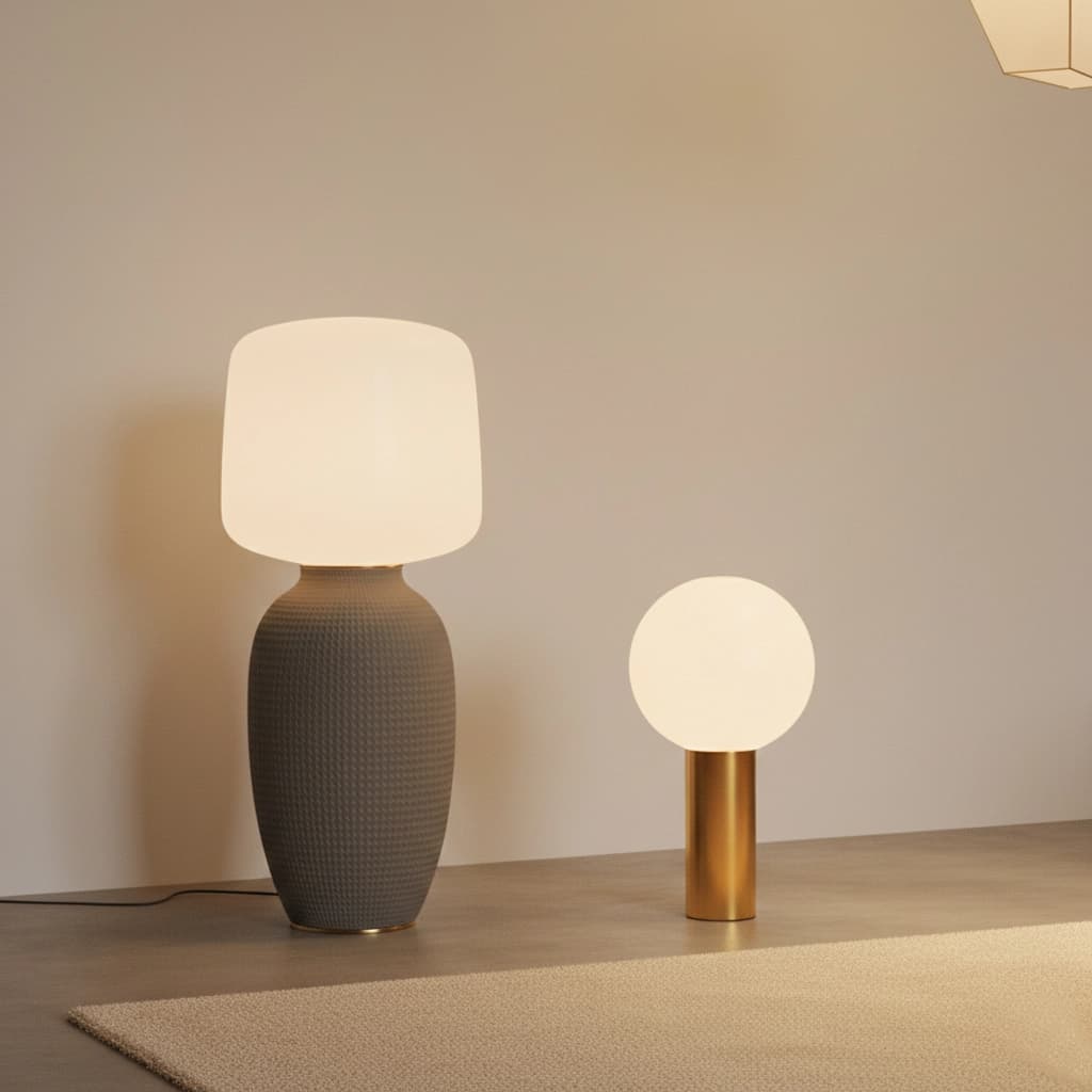
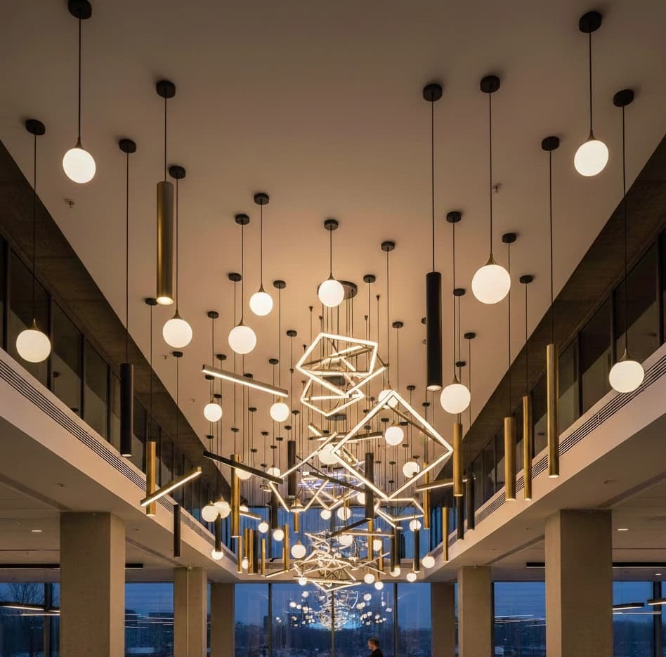
Light changes how we experience a space. At Lumina, we design and deliver lighting solutions that are thoughtful, functional, and intentional. Every detail matters, because good light isn’t just seen — it’s felt.

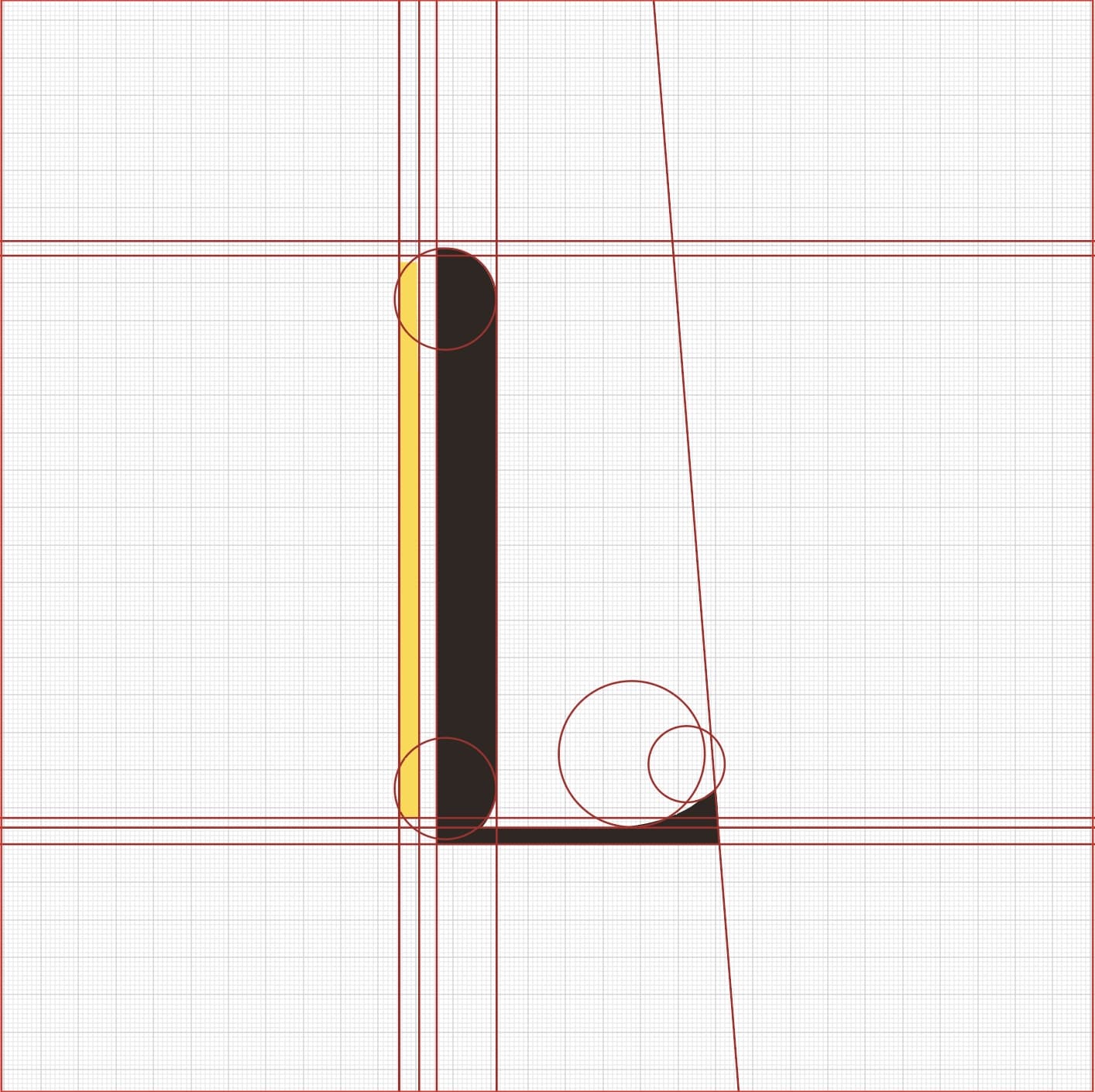
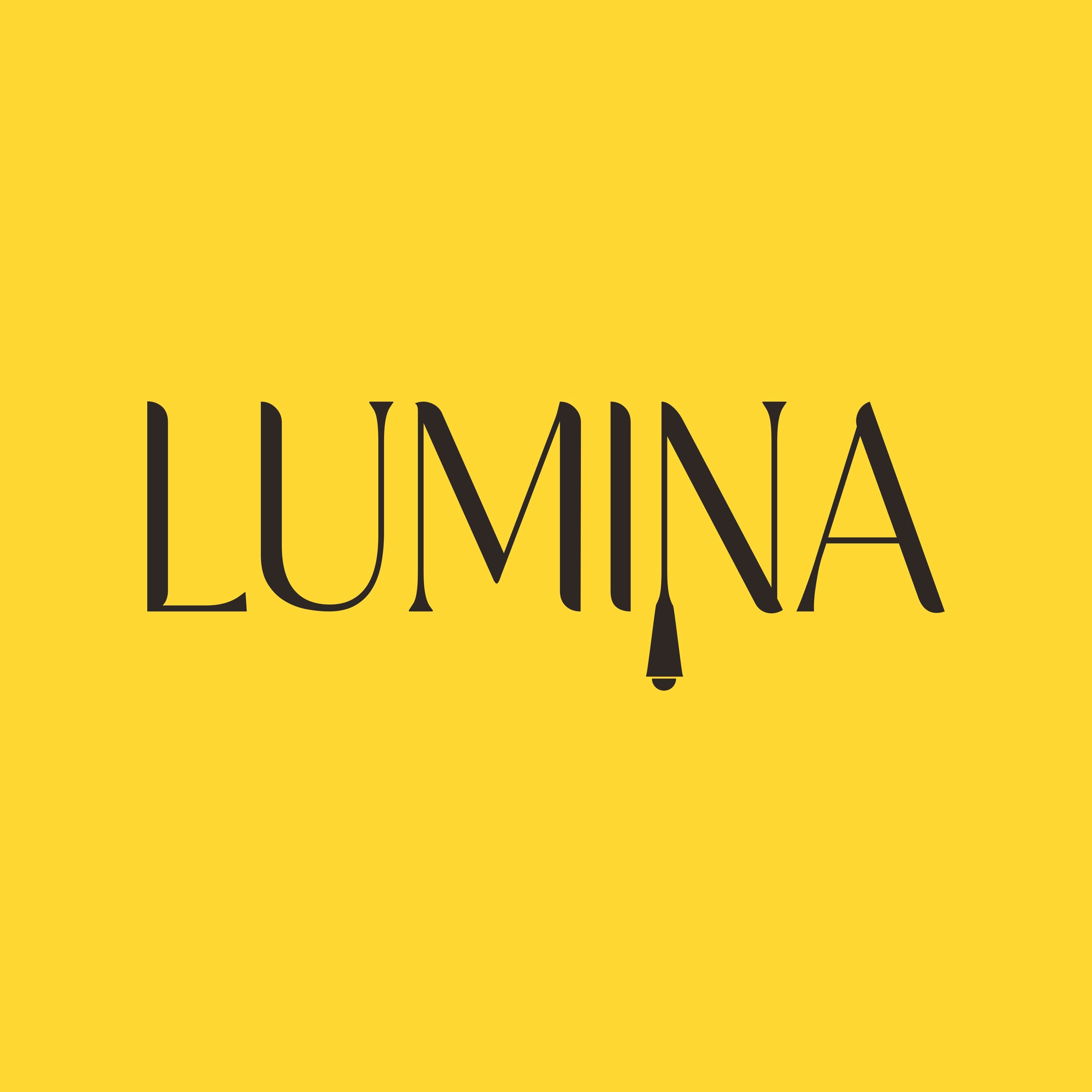
The Lumina logo is a custom wordmark that seamlessly integrates lighting elements into its typography. The letter "L" is designed as a vertical light rod, symbolizing modern architectural lighting and precision-crafted illumination. This elongated form reflects Lumina's focus on clean lines, contemporary design, and functional elegance.
A distinctive hanging pendant light is incorporated into the letterform, visually representing the brand's core offering innovative lighting solutions for interior and architectural spaces. The contrast between the dark structural form and the warm yellow accent suggests light in its purest form, communicating warmth, clarity, and ambiance.
Overall, the primary logo acts as a visual metaphor for illumination, positioning Lumina as a brand that blends design, technology, and atmosphere to create inspiring spaces.